JONQUILS

Last
Friday, I went to JONQUILS with Singing and Hope. It’s a very nice place, and I
took photos of the desserts and decorations in the coffee shop.
 |
| 4*6 |
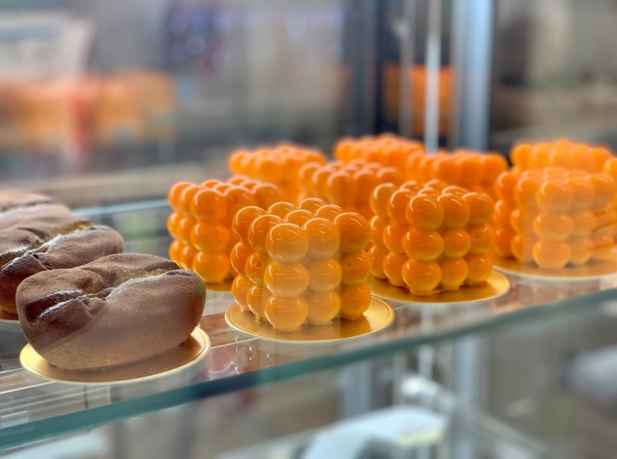
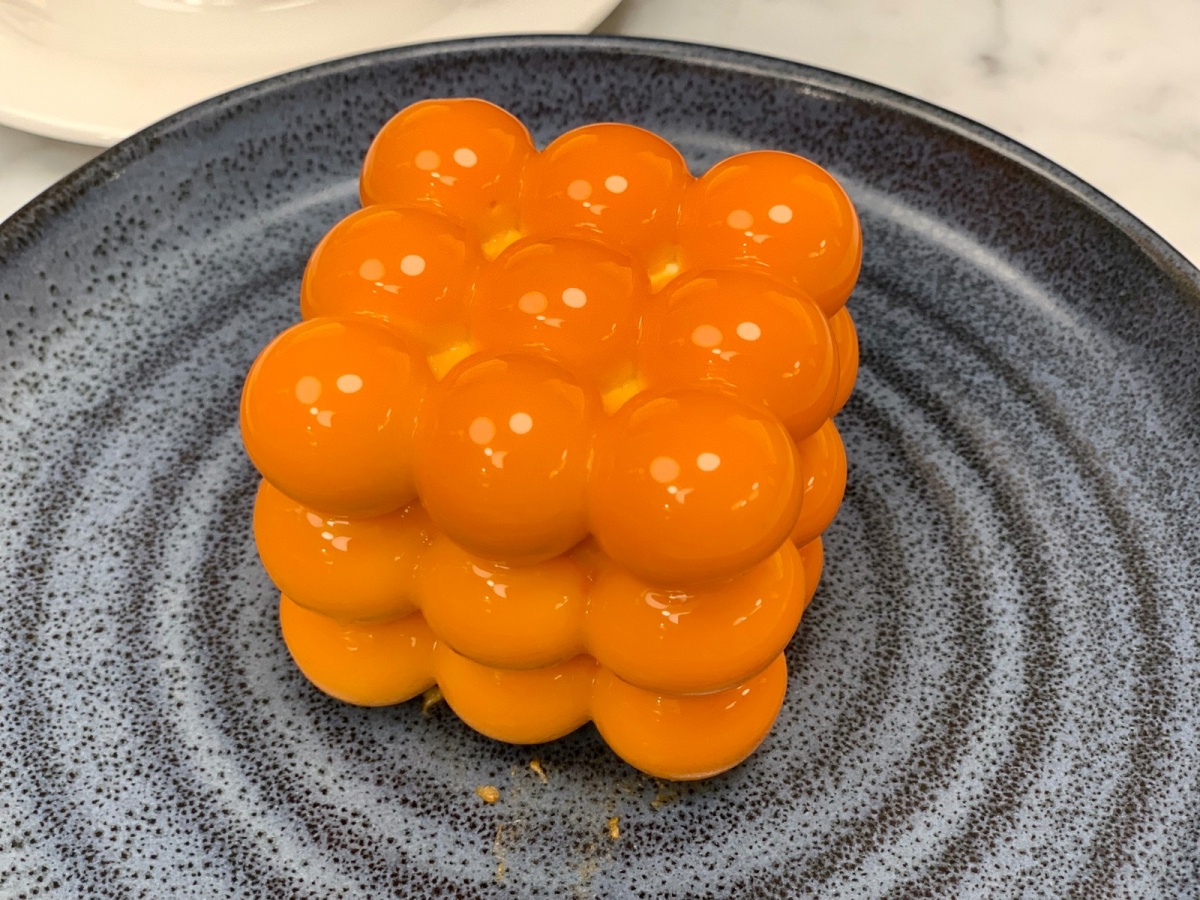
The first photo was taken of the cake below the glass. Under the action of glass and light, the cake has a good sense of luster but also has a kind of hazy sense of the combination of void and solid. For the editing process, I enhanced the brightness and contrast of this photo to make the cake look more delicious.
 |
| whole picture 4*6 |
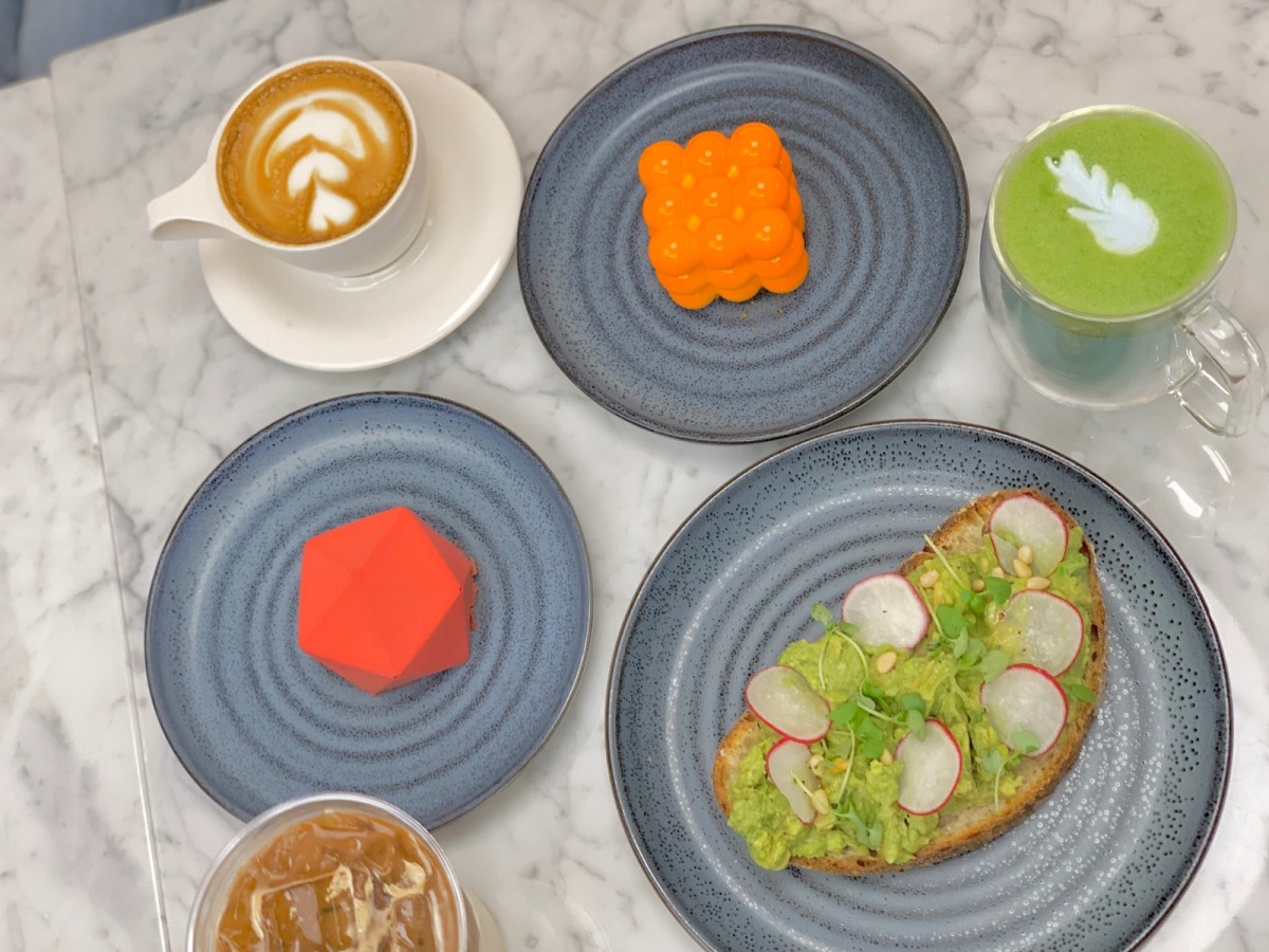
The second photo was taken as a "whole picture". With white marble as the background, make sweet dessert color more bright-colored and outstanding. I increased the brightness of the picture, reduced the contrast, and made the colors softer.
 |
| medium distance 4*6 |
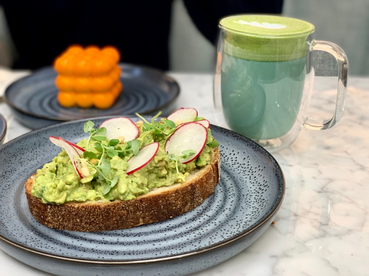
The third image is shot from a medium Angle, focusing on the central object and blurring the background. The main object in this photo is left with some white space on the right. The left side of the picture has been cropped.
 |
| center/detailed 4*6 |
This picture is the most detailed picture. It's also the object in the center. I increased the brightness and contrast of this photo to make the cake look more delicious.
 |
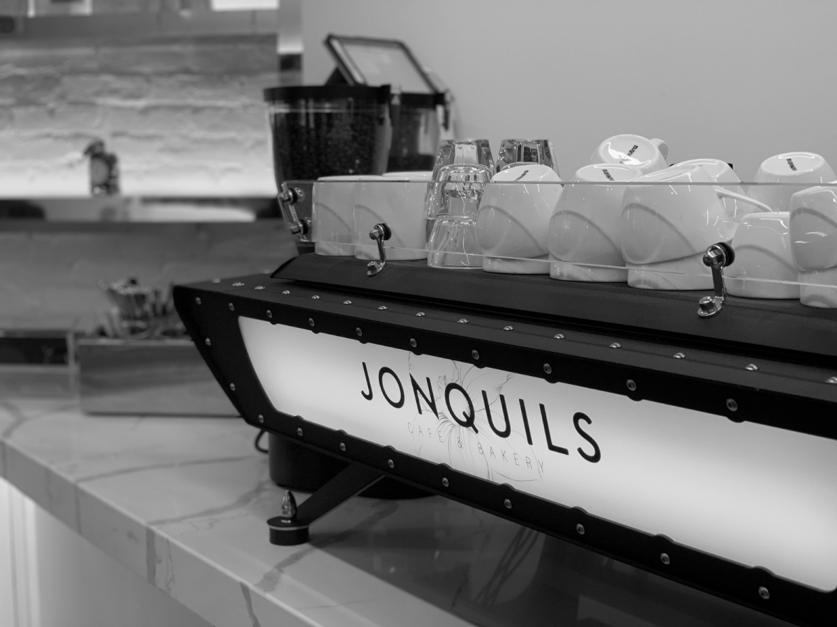
| black&white 18*24 |
This is the bar in the coffee shop. The name of the shop is on the back of the coffee machine. I turned it into black and white and enhanced the contrast to add texture to the photo.
 |
| mirror reflection 4*4 |
This picture is taken in front of the mirror. This is a wall made up of a mirror. There are different angles of the mirror on the wall. Through reflection, you can see different parts of my body. I also turned it into black and white to enhance the sense of space. And I cut it as a square to reduce complexity.
 |
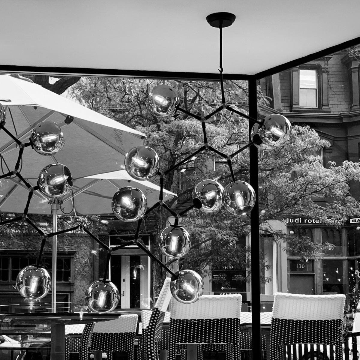
| black&white 4*4 |
This is the chandelier of the cafe. I think the shape is like a molecular structure, very simple and distinctive, like Nordic style. So I also changed it to black and white.

When choosing a photo, I chose one according to the requirements of the homework. I chose half the food and adjusted the tone and contrast to make it look shiny. The other half scenery adjustment for black and white tones highlight the sense of space also highlight the bright colors of food.
When I show my work in class, I try to make an advertisement board. Therefore, I enlarged the bar photo with the name of the store and placed it in the right middle, which played an absolutely prominent role. The rest of the dessert photos are distributed around the same size, showing a variety of food.


Comments
Post a Comment